※ 강의를 듣고 제가 이해한 내용을 바탕으로 정리한 것이라서 오류가 있을 수 있습니다.
버튼 사이즈 조절하기
버튼 크기에 large, medium, small 를 설정해줄 수 있도록 구현을 하려고 하는데
조건부로 CSS 클래스를 넣어주고 싶을때는 classnames라는 라이브러리를 사용하는 것이 편리하기
때문에 이것을 설치하여 사용하는 것이 좋다.
설치 방법은 명령 프롬프트로 자신의 프로젝트 디렉토리로 이동한 뒤 아래의 명령어를 입력해주면 된다.
npm add classnames
component/Button.js
import React from 'react';
import classNames from 'classnames';
import './Button.scss';

// size: large, medium, small

function Button({ children, size }) {
return <button className={classNames('Button', size)}>{children}</button>; {/* 설치해준 classNames 라이브러리에 Button.scss와 size props 넣어줌 */}
}

Button.defaultProps = { // size props 기본값으로 medium
    size: 'medium'
};

export default Button;
이제 props 로 받은 props 값이 button 태그의 className 으로 전달이 된다.
이제 이에 따라 Button.scss 에서 다른 크기를 지정해줘야한다.
component/Button.scss
$blue: #228be6; // 변수 선언시 앞에 $사인 사용해야됨

.Button {
    display: inline-flex;
    align-items: center;   // 텍스트를 버튼의 중앙에 위치 시키게 하는 것들
    justify-content: center;
    color: white;
    font-weight: bold;
    outline: none;
    border: none; // 원래 버튼에는 테두리가 있는데 그것을 없앰
    border-radius: 4px; // 둥글게 하는것
    cursor: pointer; // 커서를 올리면 포인터 모양으로 됨

    // 버튼 크기
    &.large {
        height: 3rem;
        padding-left: 1rem;
        padding-right: 1ren;
        font-size: 1rem;
    }

    &.medium {
        height: 2.25rem; // 버튼 크기
        padding-left: 1rem;
        padding-right: 1rem;
        font-size: 1rem; // 크롬 기본 폰트 크기 16px * 1 rem =16px
    }

    &.small {
        height: 1.75rem;
        font-size: 0.875rem;
        padding-left: 1rem;
        padding-right: 1rem;
    }

   	background: $color; // 위에 변수로 지정한 것을 사용
    &:hover { // & 연산자는 button 자기 자신을 가르키게 됨
        background: lighten($color, 10%); // lighten이라는 함수로 밝기를 조절 가능, 두번째 파라미터에는 얼마나 밝게 할지 지정
    }
    &:active { // 클릭 했을 때
        background: darken($color, 10%);
    }

    & + & { // 버튼 사이 여백
        margin-left: 1rem;
    }
위 코드와 같이 버튼 모양과 크기를 지정해준다.
App.scss
.App {
    width: 512px;
    margin: 0 auto;
    margin-top: 4rem;
    border: 1px solid black;
    padding: 1rem;
    .buttons + .buttons {
        margin-top: 1rem;
    }
}
버튼을 감싸는 테두리를 만들기 위한 scss 파일
App.js
import React from 'react';
import Button from './components/Button';
import './App.scss';
function App() {
return (
<div className="App">
<div className="buttons">
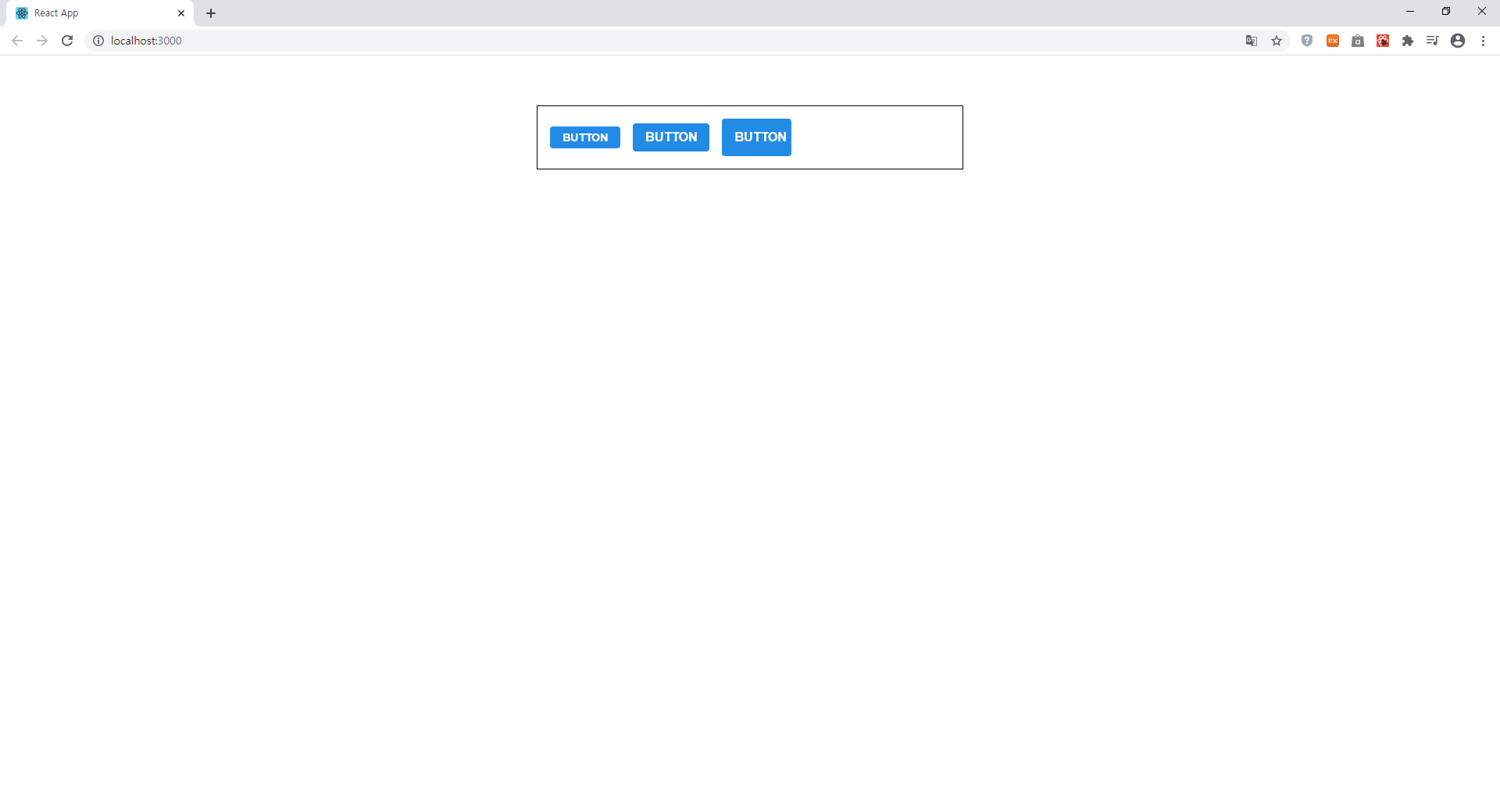
<Button size="small">BUTTON</Button> {/* 사이즈 small 부터 순서대로 large까지 */}
<Button>BUTTON</Button> {/* 기본값이 medium이라서 설정 안해도 됨 */}
<Button size="large">BUTTON</Button>
</div>
</div>
);
}
export default App;App.js에서 Button 컴포넌트를 불러와준다.
실행 결과
'개발 공부한 내용 정리 > React' 카테고리의 다른 글
| React- SASS로 컴포넌트 스타일링- 버튼 outline, full width 옵션 설정 (0) | 2020.10.05 |
|---|---|
| React- SASS로 컴포넌트 스타일링- 버튼색상 설정 (0) | 2020.10.04 |
| React- 컴포넌트 스타일링- SASS (0) | 2020.10.02 |
| React- 클래스형 컴포넌트로 카운터 만들기 (0) | 2020.10.01 |
| React- 클래스형 컴포넌트 선언 (0) | 2020.09.29 |