※ 강의를 듣고 제가 이해한 내용을 바탕으로 정리한 것이라서 오류가 있을 수 있습니다.
Dialog 만들기
기존 화면을 가리게 되면서 정보를 보여주게 되는 Dialog 컴포넌트를 만들어보겠다.
components/Button.js
import React from 'react';
import styled, { css } from 'styled-components';
import { darken, lighten } from 'polished';


const StyledButton = styled.button`
    /* 공통 스타일 */
    display: inline-flex;
    outline: none;
    border: none;
    border-radius: 4px;
    color: white;
    font-weight:bold;
    cursor: pointer;
    padding-left: 1rem;
    padding-right: 1rem;

    /* 크기 */
    ${props =>
        props.size === 'large' &&
        css`
            height: 3rem;
            font-size: 1.25rem;
        `}

    ${props =>
        props.size === 'medium' &&
        css`
            height: 2.25rem;
            font-size: 1rem;
        `}

    ${props =>
        props.size === 'small' &&
        css`
            height: 1.75rem;
            font-size: 0.875rem;
        `}

    /* 색상 */
    ${props => {
        const color = props.theme.palette[props.color];
        return css`
            background: ${color};
            &:hover {
                background: ${lighten(0.1, color)};
            }
            &:active {
                background: ${darken(0.1, color)};
            }
            ${props =>
            props.outline &&
            css`
                color: ${color};
                background: none;
                border: 1px solid ${color};
                &:hover {
                    background: ${color};
                    color: white;

                }
            `}
        `;
    }}

    /* 버튼 간의 간격 */
    & + &{
        margin-left: 1rem;
    }

    /* fullWidth */
    ${props => props.fullWidth &&
    css`
        width: 100%;
        justify-content: center;
        & + & {
            margin-left: 0;
            margin-top: 1rem;
        }
    `}

`;

function Button({ children, color, size, outline, fullWidth, ...rest }) {
return <StyledButton color={color} size={size} {...rest} outline={outline} fullWidth={fullWidth}>{children}</StyledButton>;
}

export default Button;
이전 포스트들에서 만들었던 버튼 컴포넌트 재사용
components/Dialog.js
import React from 'react';
import styled from 'styled-components';
import Button from './Button';

const DarkBackground = styled.div`
  position: fixed;
  left: 0;
  top: 0;
  width: 100%;
  height: 100%;
  display: flex;
  align-items: center;
  justify-content: center;
  background: rgba(0, 0, 0, 0.8);
`;

const DialogBlock = styled.div`
  width: 320px;
  padding: 1.5rem;
  background: white;
  border-radius: 2px;
  /* 내부에 CSS 사용 가능 */
  h3 {
    margin: 0;
    font-size: 1.5rem;
  }
  p {
    font-size: 1.125rem;
  }
`;

const ButtonGroup = styled.div`
  margin-top: 3rem;
  display: flex;
  justify-content: flex-end;
`;

function Dialog({ title, children, confirmText, cancelText }) {
  return (
    <DarkBackground>
      <DialogBlock>
        <h3>{title}</h3>
        <p>{children}</p>
        <ButtonGroup>
          <Button color="gray">{cancelText}</Button>
          <Button color="pink">{confirmText}</Button>
        </ButtonGroup>
      </DialogBlock>
    </DarkBackground>
  );
}

Dialog.defaultProps = {
  confirmText: '확인',
  cancelText: '취소'
};

export default Dialog;
styled-components 에서도 CSS 문법을 사용 할 수 있기 때문에 DialogBlock 안에 있는 h3 와 p 에게 특정 스타일을 주고 싶다면 위 코드의 주석 처리한 곳과 같이 작성할 수 있다.
App.js
import React from 'react';
import styled, { ThemeProvider } from 'styled-components';
import Button2 from './components/Button';
import Dialog from './components/Dialog';
const AppBlock = styled.div`
width: 512px;
margin: 0 auto;
margin-top: 4rem;
border: 1px solid black;
padding: 1rem;
`;
const ButtonGroup = styled.div`
& + & {
margin-top: 1rem;
}
`;
const palette = {
blue: '#228be6',
gray: '#496057',
pink: '#f06595'
};
function App() {
return (
<ThemeProvider theme={{palette}}>
<>
<AppBlock>
<ButtonGroup>
<Button color="blue" size="small">BUTTON</Button>
<Button color="pink" size="medium">BUTTON</Button>
<Button color="gray" size="large">BUTTON</Button>
</ButtonGroup>
<ButtonGroup>
<Button color="blue" size="small" outline>BUTTON</Button>
<Button color="pink" size="medium" outline>BUTTON</Button>
<Button color="gray" size="large" outline>BUTTON</Button>
</ButtonGroup>
<ButtonGroup>
<Button color="blue" size="large" fullWidth>BUTTON</Button>
<Button color="pink" size="large" fullWidth>BUTTON</Button>
<Button color="gray" size="large" fullWidth>BUTTON</Button>
</ButtonGroup>
</AppBlock>
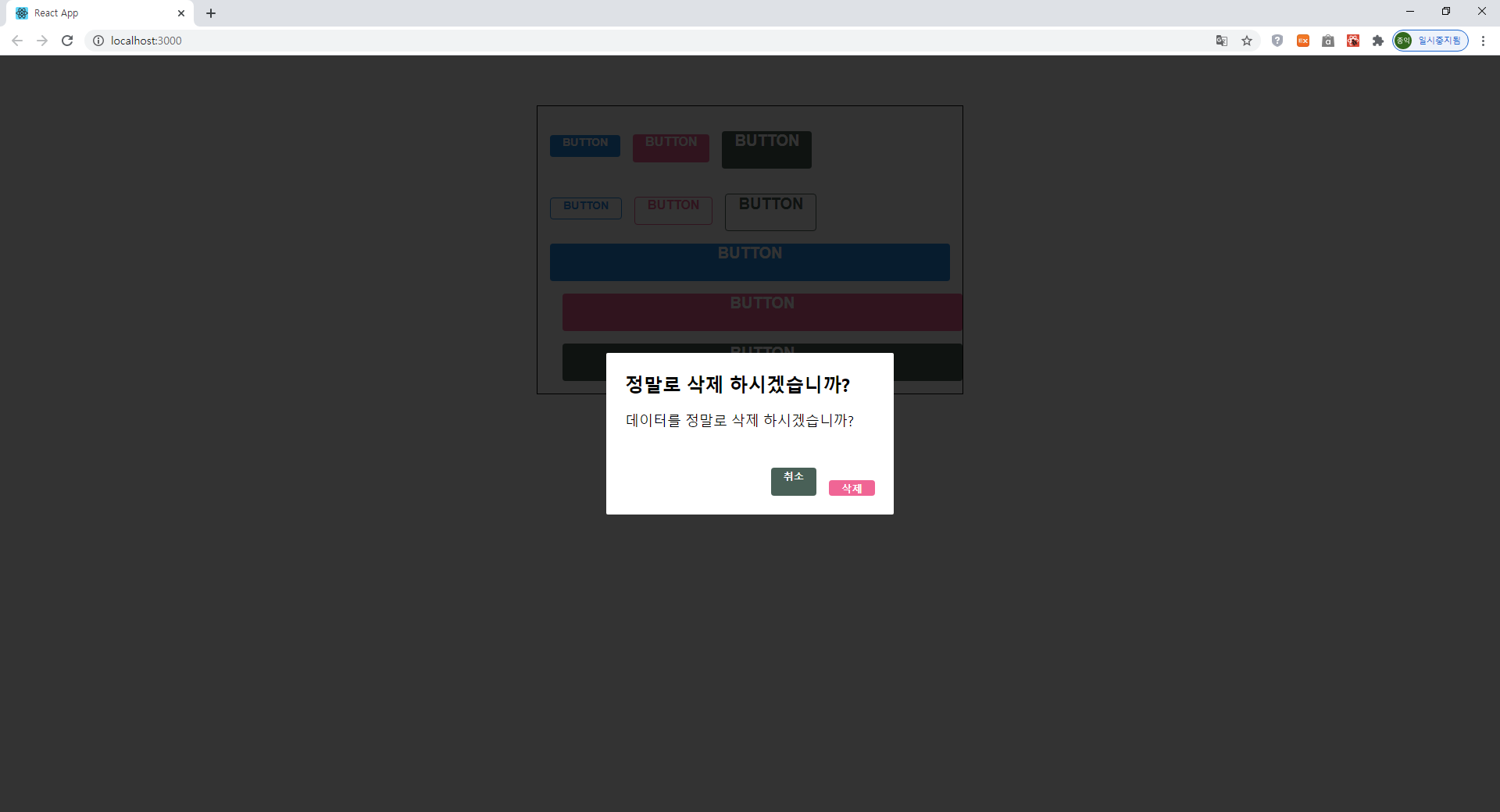
<Dialog title="정말로 삭제 하시겠습니까?"
confirmText="삭제"
cancelText="취소"
>
데이터를 정말로 삭제 하시겠습니까?
</Dialog>
</>
</ThemeProvider>
);
}
export default App;Dialog 컴포넌트를 AppBlock 아래에 넣어 주었고 ThemeProvider 내부는 하나의 리액트 엘리먼트로 감싸져있어야 하기 때문에 AppBlock 과 Dialog 를 <></> 으로 감싸주었다.
실행 결과
'개발 공부한 내용 정리 > React' 카테고리의 다른 글
| React- API 연동의 기본 (0) | 2020.10.16 |
|---|---|
| React- Dialog에 트랜지션 효과 구현 하기 (0) | 2020.10.14 |
| React- styled-components 버튼 outline, fullWidth (0) | 2020.10.12 |
| React- styled-components 버튼 사이즈 조정하기 (0) | 2020.10.11 |
| React- polished의 스타일 관련 유틸 함수 사용하기 (0) | 2020.10.10 |